Why You Shouldn’t Use a Slider on WordPress?
Image sliders may be quite a popular feature among WordPress websites but their added value is close to none. In fact, whether you ask a performance-minded web developer, an SEO expert or a conversion rate specialist, most will tell you that sliders – or carousels – aren’t a good idea. And we couldn’t agree more.
Why a Slider is not Good for Performance
Sliders and web performance are far from a match made in heaven. With sliders, your website might be pretty but also pretty slow (see what we did here?).
For a slider to work on your website, you’ll need more code:
- CSS styles
- Extra JavaScript
Most of the time, this leads to:
- Increased page size
- Increased page load time
- Higher number of HTTP requests
All of this causes lower performance, worse Core Web Vitals metrics, and slower pages.
More specifically, carousels can affect your Core Web Vitals in the following ways:
- LCP – Largest Contentful Paint – A page’s LCP element can often be found in above-the-fold image sliders. If these sliders aren’t optimized properly, this can negatively affect your LCP.
- FID – First Input Delay – If your sliders contain heavy JavaScript files, JavaScript execution time will be longer. As a result, the main thread could become busy and blocked, and the page might not be able to respond to user interactions.
- CLS – Cumulative Layout Shift – Many sliders are unfortunately visually unstable, which can lead to a poor CLS grade.
Of course, not all image sliders will have the same impact on your website depending on the amount of customization, the size of the library, and so on. But even in the case of so-called “fast” image slider plugins, the effects will be detrimental to your performance:
Other Performance Bad Practices
In general, animations placed above the fold are not your website’s best friends. This includes text animations too which carry the same pitfalls as image sliders. Animations present at the top of the page are not only irrelevant for conversions, they also push down your content. Unless they play an important role in conveying your brand image, remember that it’s your content that sells, ranks and converts, not your animations.
We also recommend against page preloaders (i.e. the spinner or loading bar some sites display before the actual content appears). If you are using one at the same time as you are delaying JavaScript files, this will cause the preloader to be displayed until there’s user interaction. And if there’s no user interaction, the spinner will simply spin endlessly. Preloaders prevent users from seeing the content right away which is not great for UX. Not to mention that they are counterproductive because they slow down websites. Why add one second of spinner when you could just have a faster loading website?
Why You Won’t Make the Most Out of the Delay JS Feature.
Delay JavaScript Execution improves performance by delaying the loading of JavaScript files until there is a user interaction. When this feature is enabled, all JavaScript files are delayed and loaded only when users need them, i.e. when a user interaction is detected (e.g. scrolling, clicking a button).
But here’s the thing: if you have a slider at the top of a page and the Delay JS feature is enabled, the slider’s content will be delayed and the content won’t show during the initial render of the page. Pointless, right? The workaround is unfortunately to disable the feature for the JavaScript files related to the slider.
Sliders and Web Performance: the Proof Is in the Pudding
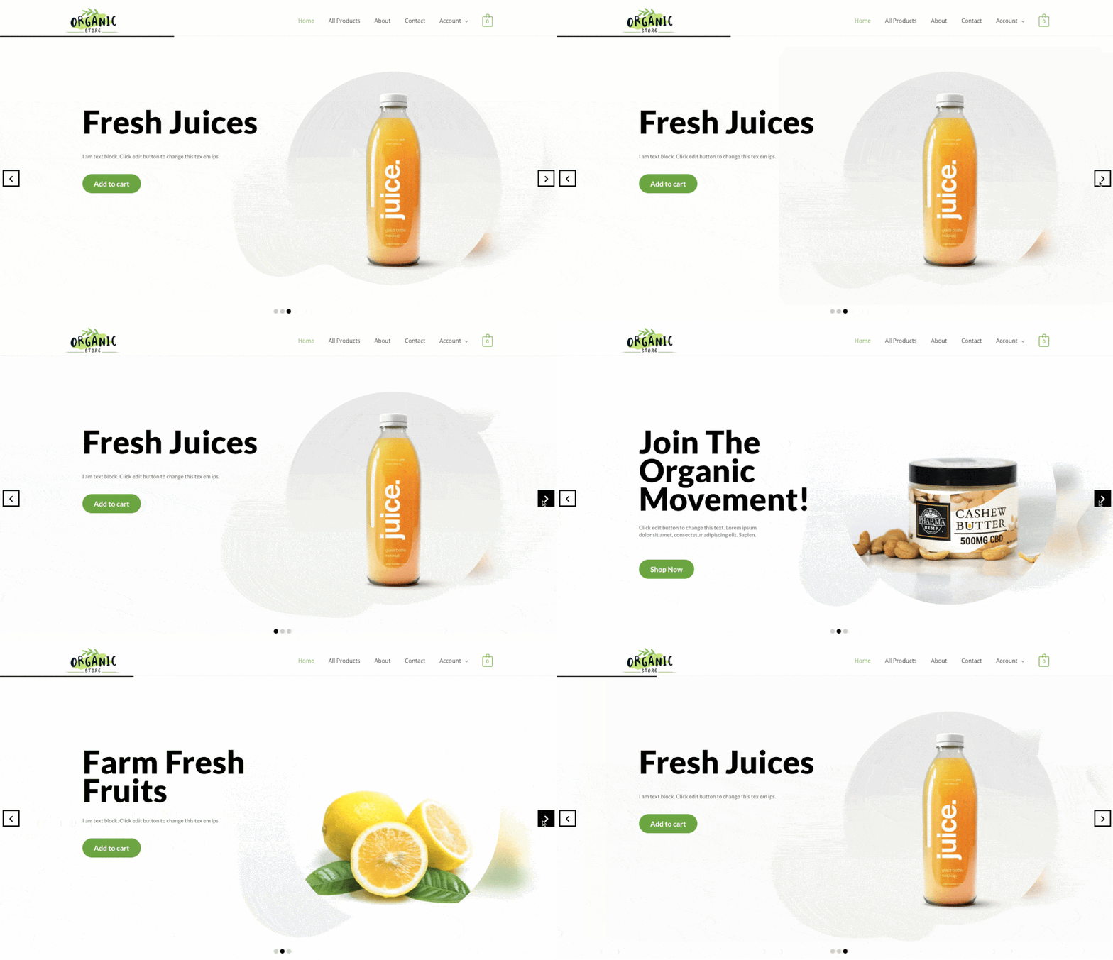
We covered 4 scenarios:
- Audit #1: We measured the performance of our website with Revolution Slider but without the Delay JavaScript Execution feature enabled.
- Audit #2: We measured the performance of our website with Revolution Slider and with the Delay JavaScript Execution feature enabled.
- Audit #3: We measured the performance of our website with Revolution Slider and with the Delay JavaScript Execution feature enabled. The script related to the slider was excluded.
- Audit #4: We measured the performance of our website with a static image and with the Delay JavaScript Execution feature enabled.
Let’s see the results:
Audit #1: Revolution Slider without Delay JavaScript Execution
As you can see, the score is orange (55/100) and the Core Web Vitals are not very healthy.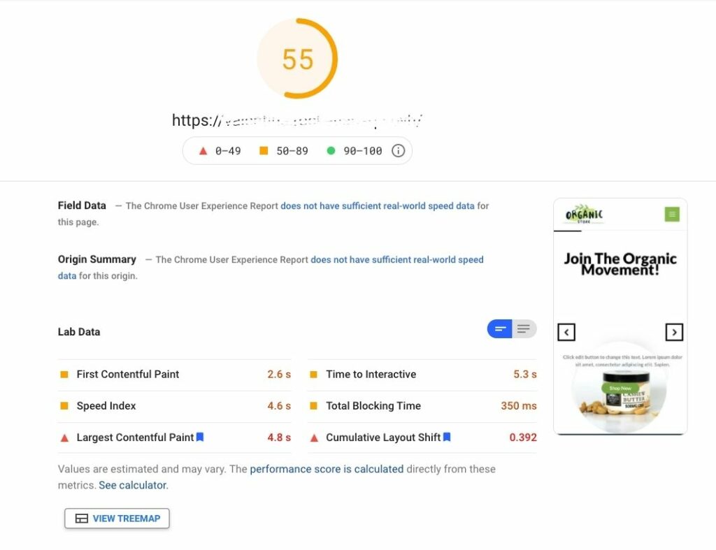
Audit #2: Revolution Slider with Delay JavaScript Execution
As you can see, the score is in the green (90/100) and we achieved much better results overall.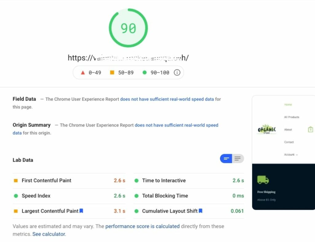
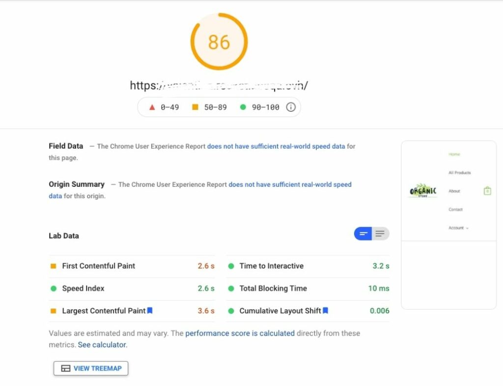
Audit #3: Revolution Slider with Delay JavaScript Execution and slider excluded
As you can see, the score is also green but not as great (86/100) and there are again issues with unused resources and images.
Audit #4: No Slider with Delay JavaScript Execution
Instead of using a slider, we added a static image this time:
As you can see, the results were the best out of all scenarios, our score was in the green and we got rid of unused JavaScript issues.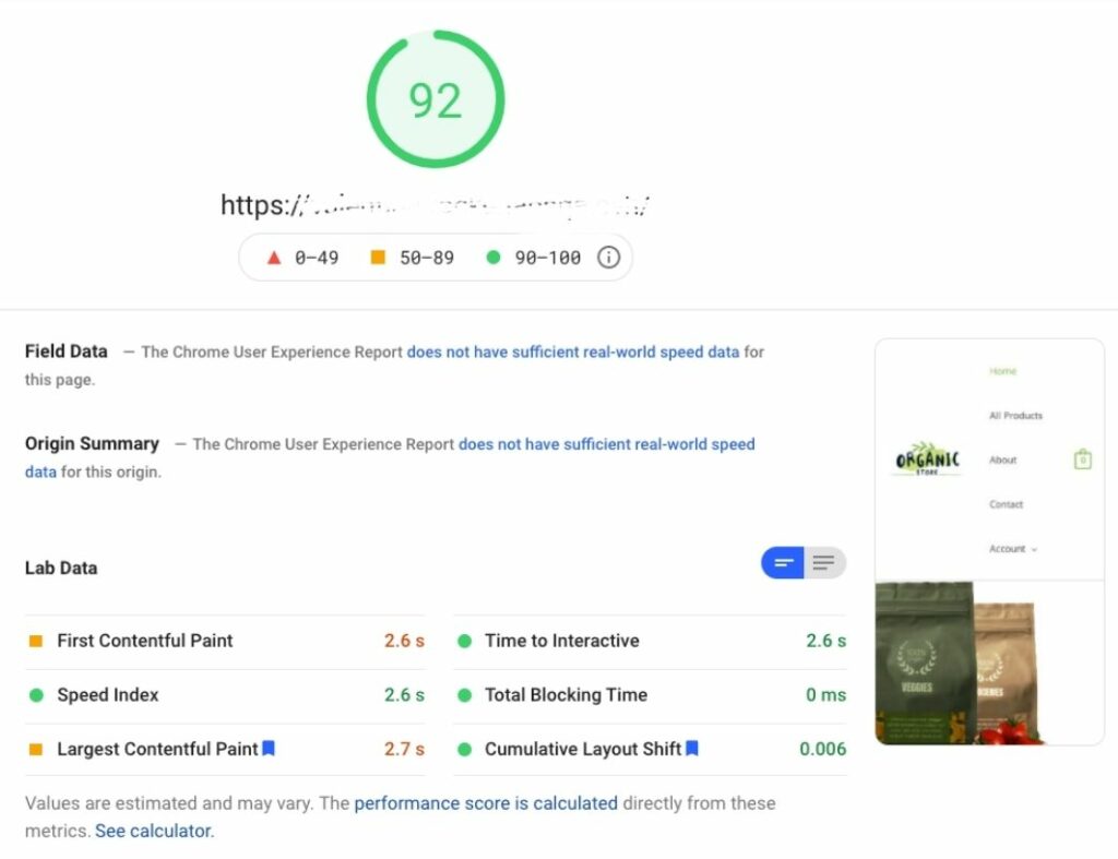
How Sliders Can Affect SEO
With the Core Web Vitals rollout, optimizing your page speed on WordPress is now more important than ever for SEO. As we’ve just seen, sliders slow pages down, there’s no way around it. And research shows that poor performance is only one aspect of sliders that negatively affects SEO. Other reported issues include multiple H1 headings and flash usage for example.
Furthermore, Google’s last update is all about user experience: to rank well, your page needs to deliver the best experience possible to your users. Unfortunately, usability and carousels don’t quite go hand in hand. Sliders can be confusing to users: rotating offers don’t make it clear what you want to put forward. If you can’t choose, visitors won’t be able to either! And these days, bad UX can only undermine your SEO efforts. Sliders also pose accessibility issues for keyboard and screen reader users, which in turn will impact your SEO.
Sliders and Conversion Rates
As we’ve just shown, sliders have a bad effect on the overall user experience. Add to that the fact that only 1% of people actually click on a slider, which almost always is the first slide, it’s easy enough to come to the conclusion that sliders don’t convert.
Given the little interaction they create, sliders are a completely ineffective way to reach your target audience. The content after the first slide will be missed entirely by your users. In some cases, visitors might skip your slider altogether due to “banner blindness” or thinking it’s an ad. Either way, you won’t get your message across.
Bottom line is, if the goal of your website is to trigger conversions, you’ll be much better off trying to improve your loading time as well as your Core Web Vitals metrics than adding sliders, or any sort of animation for that matter.
Even Google agrees with us 😉
The Right Alternatives
Think you can’t live without a carousel? Think again. “Website owners can use a single, static image in the place of sliders. “An image is something that will stand out, and convey the message they want to pass.” If you want to showcase multiple images, design your own photo gallery instead.
Static sliders could also be an alternative. They still carry usability and conversion issues but their impact on performance is not as bad. In any case, stay clear of animations. Seriously though.


